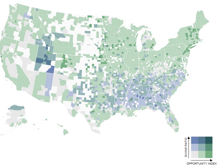
According to an analysis by The Chronicle of Philanthropy, "American communities with high standards of living often have low charitable giving rates."
The Chronicle of Philanthropy developed a new map that combines data from the Giving Ratio and Opportunity Index maps.
The Giving Ratio map indicates the share of income people donate to charity. The Opportunity Index map displays standard-of-living scores in counties across the United States based on 2014 data that include the unemployment rate, median household income, percent of people living below the federal poverty line, percent of adults with at least an associate’s degree, and the percent of households spending less than 30 percent of income on housing costs.
The Chronicle combined those two maps to show how the giving rates and opportunity measures intersect in each county. Overlapping the maps shows all combinations of low, moderate, and high values for donations and opportunity indicators. Data utilized for this map is from The Chronicle's How America Gives study. Read more...
How America Gives
Explore American charitable giving throughout the country using this interactive tool. With it, you can see giving by state, major metropolitan area, county, and ZIP code in 2012, including breakdowns by income bracket.
The Opportunity Index
The Opportunity Index is an annual composite measure at the state and county levels of economic, educational and civic factors that expand opportunity